
Land & Society
A Neighborhood in Four Colors: Understanding Redlining Maps
Four colors condensed neighborhood appraisals into a striking map. Understanding redlining requires reading those grades alongside discriminatory policy, lending history, and the people beyond the files.
On This Page
The map looks familiar until the colors begin to matter. Streets, railways, rivers, and neighborhood names provide a recognizable city. Across that framework, green, blue, yellow, and red areas assign different grades to places where people lived. The lines are not property boundaries. They are boundaries of appraisal, drawn by people whose judgments connected housing, money, and race.
Maps produced for the Home Owners’ Loan Corporation, usually abbreviated HOLC, have become some of the most widely recognized documents in the history of housing discrimination. Reading them carefully means asking what their colors represented, who supplied the assessments, and how the maps fit within a larger system. Their significance is considerable, but they cannot explain every housing outcome by themselves.
A mortgage crisis and a mapping program
HOLC was established in 1933 during the Great Depression to refinance troubled home mortgages. Its rescue lending and its later neighborhood appraisal work were related activities within the same institution, rather than one identical operation. That distinction matters when evaluating what the maps did.
The Mapping Inequality project, maintained by the University of Richmond and collaborators, provides digitized maps and the area descriptions prepared alongside them. These records turn a broad historical subject into something readers can examine at neighborhood scale.
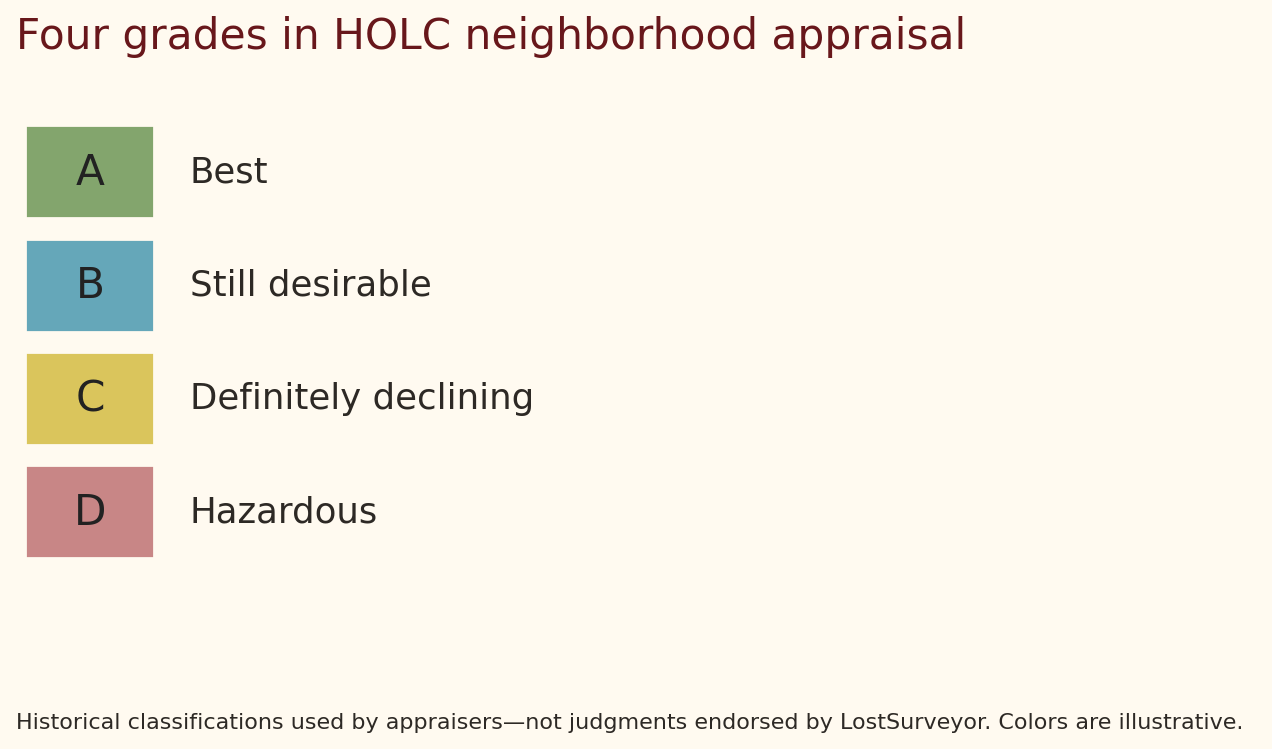
The colors summarized appraisers’ assessments of mortgage security. Grade A areas were green, B blue, C yellow, and D red. The historical labels described A as “best,” B as “still desirable,” C as “definitely declining,” and D as “hazardous.” Those are the appraisers’ judgments, not neutral descriptions of the people living there.
LostSurveyor. CC BY 4.0. Original explanatory diagram. Schematic, not to scale.
A letter and color condensed a complicated collection of statements into a powerful visual shorthand. That compression is central to the map’s historical importance. It made assumptions about neighborhoods appear as an orderly classification that could be read at a glance.
What the map actually shows
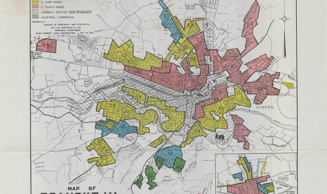
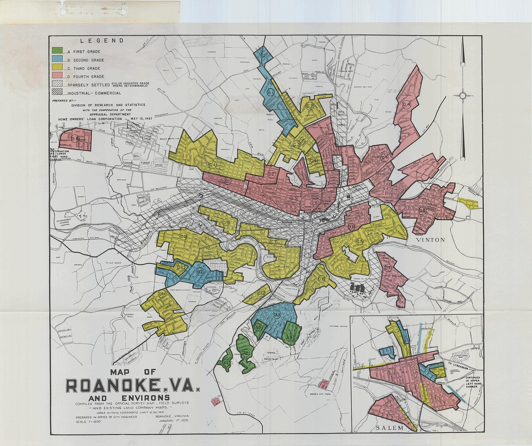
The Roanoke, Virginia, map reproduced below illustrates the system. Its underlying city-engineer’s map is dated January 1, 1935. The HOLC research and appraisal annotation is dated May 15, 1937. Those dates are printed in different parts of the document. Identifying both avoids confusing the age of the base map with the date of the appraisal.
Home Owners’ Loan Corporation; scan via Mapping Inequality. CC BY-SA 4.0. Source and rights record. Resized for web display; no content alteration.

The colored outlines group areas rather than trace individual deeds. Rail corridors, streets, and patterns of development help orient the reader, while an inset brings Salem into the sheet. Uncolored and hatched areas also have meanings in the legend. They should not automatically be assigned the nearest residential grade.
The map reveals how the city was categorized, but it does not display every loan decision. A red area is not proof that every resident was refused every mortgage. Nor does a green area prove equal treatment of every applicant. Neighborhood appraisal, individual lending, insurance policy, and private transactions are different layers of the history.
For closer inspection, the image credit links to the full-resolution record. The original can make small labels legible that are difficult to read within a web page. The accompanying descriptions available through Mapping Inequality supply information that the colored polygons alone cannot contain.
Looking behind the colors
HOLC area descriptions considered buildings, income, development, and other neighborhood characteristics. They also treated racial and ethnic composition as part of investment risk. Discriminatory assumptions were written into professional-looking assessments, giving prejudice an administrative form.
This is why simply treating the maps as early assessments of building condition misses their meaning. A roof, the age of a house, and the identity of its occupants are not interchangeable kinds of evidence. Yet the appraisal system placed social identities within a framework used to judge the security of property investment.
The Mapping Inequality team has transcribed and organized many of the descriptions so readers can move between a mapped area and the statements attached to it. The original documents contain offensive terminology. Reading them critically preserves evidence of discrimination without adopting their language as an acceptable way to describe a community.
The records also leave residents’ own experiences largely outside the frame. A neighborhood graded poorly still contained households, businesses, churches, mutual assistance, and ambitions. The grade describes an institution’s view of a place. It does not measure the worth of that place or its people.
HOLC was not the whole system
The Federal Housing Administration, or FHA, insured qualifying mortgages and developed its own underwriting policies. Its role was different from HOLC’s refinancing work. The FHA’s 1938 Underwriting Manual, preserved by HUD, contains explicit discriminatory policy references. Mortgage insurance could influence which kinds of loans lenders considered attractive.
The Federal Reserve’s historical account of redlining places FHA policy within a wider relationship between public programs and private discrimination. Racial exclusion did not begin with a government map. Restrictive practices in real estate and lending already existed, and federal institutions helped reinforce them.
Research also cautions against assuming FHA simply copied the familiar HOLC sheets. A study by Price Fishback and colleagues finds that FHA implemented its own redlining methodology before the HOLC maps and questions the maps’ effect on the geographical distribution of the two agencies’ early activity. Distinguishing the institutions improves the explanation of discrimination rather than diminishing its seriousness.
A lasting pattern, with careful questions about cause
Researchers have found important relationships between historical appraisal grades and later neighborhood conditions. The challenge is determining how much a map caused, how much it recorded, and how its influence interacted with other policies and practices.
A 2021 study by Daniel Aaronson, Daniel Hartley, and Bhashkar Mazumder used comparisons around map boundaries and other methods to investigate long-term effects. It found evidence of reduced homeownership and property values and increased segregation associated with the maps. This is a research finding about patterns across places, not a complete explanation of every neighborhood on a particular sheet.
Other work emphasizes the disadvantages that existed before the classifications. Fishback, Jessica LaVoice, Allison Shertzer, and Randall Walsh examine how prior discrimination and poverty had already shaped where Black households could live. These perspectives address different parts of the question. Existing inequality and later reinforcement need not be mutually exclusive explanations.
For a reader, the useful habit is to separate observation from explanation. A historical red area and a present-day disadvantaged area may overlap. Establishing that overlap is one task. Explaining its causes requires additional evidence about lending, property transactions, public investment, population change, and local decisions over time.
Law changed; history remained
The Fair Housing Act was enacted in 1968. HUD’s historical overview identifies it as a major change in federal protection against housing discrimination. Legal prohibition, however, did not instantly undo decades of unequal opportunities to buy, finance, maintain, or inherit property.
Housing connects the physical landscape to a household’s prospects. Financing can determine whether a home can be bought or repaired. Ownership can create an asset passed between generations. Access to land and credit therefore matters beyond the appearance of a street.
The four-color maps remain useful because they expose how institutions classified that landscape. Their strongest educational value comes from reading the boundaries alongside the words, the lending history, and the lives beyond the files. The result is a more exact understanding of how a map can record prejudice, help organize power, and leave questions that still deserve careful examination.
Sources and further reading
- Mapping Inequality: maps, area descriptions, and project introduction.
- HUD: FHA’s 1938 Underwriting Manual.
- Federal Reserve History: Redlining.
- Aaronson, Hartley, and Mazumder: effects of HOLC maps.
- Fishback and colleagues: federal housing-program evidence and race, poverty, and HOLC appraisal.
- HUD history and the 1968 Fair Housing Act.